Working with ZenVR
Developing an on-boarding system for VR meditation
Scroll ↓
In this study, you’ll learn how I synthesized insights from different types of meditators from all over the world, and how we used these insights to develop a fun VR tutorial to succinctly direct learners to the right place in the program.
👓 Project Specs
Client: ZenVR
Timeframe: 16 weeks (1 semester)
My role: UX Researcher
Team: Abhishek Patil, UX Developer
Supervisor: Matt Golino, CEO of ZenVR
Methods: Lit review, competitive analysis, user interview, generative survey, focus group, contextual inquiry, usability test
Tools: Qualtrics, Figma, Miro, Unity
What is ZenVR?
ZenVR is an immersive virtual reality experience which teaches learners how to meditate through a series of real-world-applicable lessons. It provides a blend of meditation technique with spiritual philosophy.
Initial Problem
ZenVR lacked a system for which to categorize users based on their unique background and motivations.
Initially, we needed to know:
What are the categories of users?
How do we implement these categories into onboarding?
The Previous Onboarding
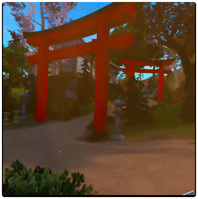
When I joined the project, the existing onboarding was a simple path to a dojo.
The user must interact with easily missed orbs of light to hear dialogue.
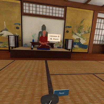
Once in the dojo, the user learns about ZenVR’s available lessons through dialogue and visuals.
The Research Roadmap
-
Secondary
Lit Review
To uncover existing info on meditators’ motivations
Competitive Analysis
To understand the industry standard and see how we can do better
-
Primary
User Interviews
To paint a picture of a meditator’s story
Survey
To validate and generalize findings
Focus Group
To understand the new meditators’ perspective
Contextual Inquiry
To uncover pain points within the existing tutorial
The Research Process
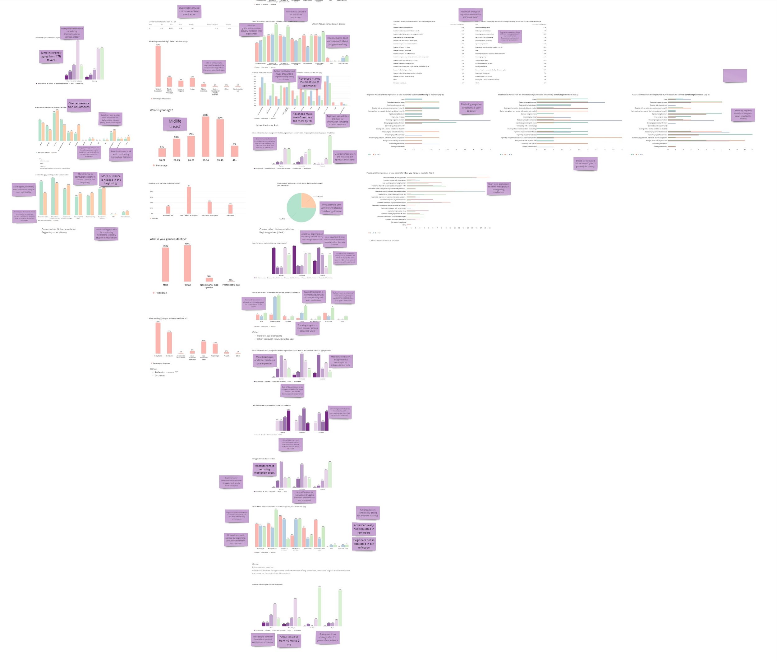
I had a large amount of data because of our in-depth research methods. To tackle this, I used many visualizations in Qualtrics and annotated them with my interpretations.
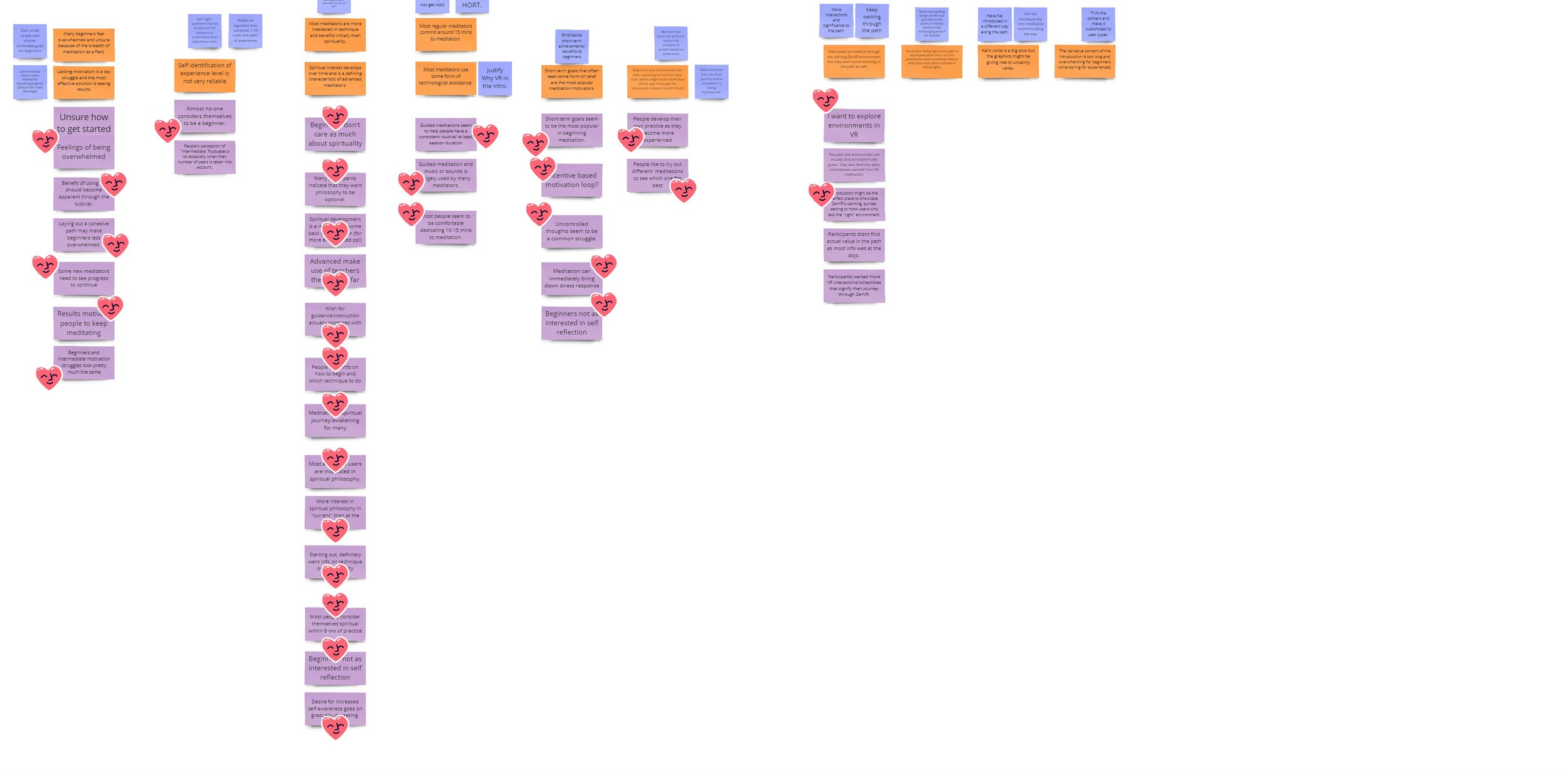
Qualitative data from our interviews, focus group, and contextual inquiries had to be condensed through multiple rounds of affinity mapping, leading to the purest insights.
When analyzing the data, I was looking out for specific insights:
How are meditators defining themselves?
On what axes do they appear to differ? Why is this significant?
Who is and isn’t interested in ZenVR, and why or why not?
What aspects of meditation are each type/experience level of user interested in?
What do meditators do to aid or enhance their own meditation practice?
Once these questions were answered, we could begin to design a fun and creative solution that takes this data into account to create a flexible and tailored solution.
Research Findings
Originally I thought the solution would be to create User Personas, but this proved to be an unnecessary step that only felt limiting and did not adequately express the individual varying aspects of our users. Instead, I came up with what I call User Dimensions.
🎓 Experience Level
❤️ Spirituality Interest
🤝 Community
🔥 Motivations
From our contextual inquiry, we concluded that there are four main pain points.
☯️ Onboarding path needs meaning
🗺️ It’s too easy to get lost
🌱 It’s too beginner focused
⏰ It’s too long
1. Make users feel represented
4. Shorten the existing onboarding while keeping important info
3. Make sure users don’t get lost
2. Collect user data to inform future content
5. Make the onboarding feel immersive and fun
Combining the insights, I came up with guiding principles for the new design.
Five Goals of the New Onboarding System
My partner and I sat down and mapped out the whole route and story for our onboarding, including the interactions and what data it would ask for and collect.
We also continuously involved our stakeholder in the process to keep him informed of our ideas and direction.
We recorded voice lines ourselves and reused most of ZenVR’s 3D assets. It was both a fun and intensive process!
Without further ado…
The New Onboarding
Evaluation
Before putting our onboarding in front of users, I wanted to receive feedback from VR experts in order to catch bugs and understand how it could be improved. I customized a heuristic evaluation test plan to fit a design assessment specifically for VR.
Expert Heuristic Evaluation Results
0 = Not a problem, 4 = severe problem
Glitchiness
Natural Engagement
Immersion
Synchrony with Body Movement
UI Design
Visibility of System Status
User Control and Freedom
Error Prevention
Usability Test
After making some adjustments based on expert feedback, I tested our onboarding with real meditators, whom I recruited through my university’s meditation club.
Some research questions I had in mind when I surveyed our participants were:
How well did the onboarding make the users feel represented as a meditator?
How was their sense of engagement?
How was the length of the onboarding? Did it drag in places? How was the length of the dialogue?
Key Findings
Overall, was immersive and fun
Some felt like it should be longer
Participants felt represented through the survey questions
Some had a hard time remembering all information given to them
Many had difficulty with VR controls
Future Recommendations
More optional info and interactions
Continue upping immersion of interactions
Let users explore, continue to optimize route
Tutorial for VR controls
My Takeaways
This project involved the most in-depth UX research I’ve ever done.
I got to try many different methods and see what worked as well as what didn’t.
The most difficult and rewarding part of it was talking to people from all over the world - Singapore, India, Peru, to name a few countries - and learning how meditation is personally meaningful to them, and in some cases, how it is ingrained into their culture.
If I could do it again, I would better scope out the timeline of this project, because the development was very time-intensive.
Overall, this project strengthened my skills as a UX Researcher through pure practice (executing diverse methods of research) and time/resource management (deciding what to do, when to do it, and how to test it).


